The contemporary landscape of Indian branding and digital design is currently witnessing a tectonic shift, a transition characterized by the move from “India”—the urban-centric, Western-imitating, English-speaking market—to “Bharat,” the vast, vernacular-first, culturally-rooted demographic inhabiting Tier 2, Tier 3, and rural clusters. This evolution represents more than a mere change in colour palettes or font choices; it is a fundamental decolonization of the Indian aesthetic. For decades, the professionalized design industry in the country operated under a “colonial hangover,” adhering strictly to Swiss minimalism, Bauhaus functionality, and the “clean” lines favoured by global corporate identity standards. However, as the “Next Billion Users” (NBU) come online—projected to exceed 950 million by 2026—the traditional Western templates are proving insufficient and often alienating to this new consumer base.
The agency perspective observes that the current design renaissance in India is not a rejection of modernity but a redefinition of it. It is a “temporal resilience” that bridges more than one lakh twenty thousand years of craft with cutting-edge digital innovation. In this new visual language, maximalism is not clutter, but abundance; vibrant colours are not “loud,” but auspicious; and vernacular scripts are not “functional,” but aspirational.
The Historical Trajectory: From Expression to Intention
The roots of the modern Indian aesthetic are found in the early 20th century, specifically through the Bengal School of Art, which emerged as a nationalist movement rejecting Western academic realism. Led by Abanindranath Tagore, this movement sought to revive Indian artistic traditions by focusing on ancient history and spirituality, utilizing techniques like the Japanese wash style to create a uniquely Asian modernism. Following independence in 1947, the journey toward a professional design voice took a different turn. The Bombay Progressive Artists’ Group, featuring luminaries like M.F. Husain and S.H. Raza, aimed to break away from European realist styles while simultaneously developing a distinctly Indian modernism that blended folk art with Western avant-garde movements like Cubism and Expressionism.
The year 1961 marked a pivotal moment with the establishment of the National Institute of Design (NID) in Ahmedabad, a direct result of the Eameses’ India Report. For the next several decades, the “NID voice” facilitated a synthesis of heritage and modernism, characterized by the 1967 Indian Airlines visual identity. This identity centered on a clean, modernist logo with a sliding crossbar suggesting motion and progress, yet it remained rooted in Indian cultural specificity. For much of the late 20th century, however, Indian design existed in its own sphere, vibrant and local but rarely entering the global conversation as an equal voice.

The modern shift is driven by a generation of designers who see design as a dialogue—a way to express values and identity rather than just decoration. As consumers have become more exposed to global standards, their expectations have risen; they now seek authenticity and simplicity that feels both premium and personal. This has led to the “Bharat” aesthetic, where even the most contemporary identities carry a quiet nod to heritage through texture, tone, or a specific way of weaving storytelling into the experience.
The Semiotics of Bharat: Colours, Patterns, and Visual Dialects
Indian design is characterized by its “poly-vocal” nature, reflecting a country built on parallel imaginations. With 28 states, eight union territories, and hundreds of languages, India functions as a “mesh” of visual dialects rather than a monolithic system. Regional aesthetics are shaped by rituals, clothing, and local heroes, appearing in everything from temple silhouettes to the drape of a saree.
The Psychology of the Indian Colour Palette
In global branding, colours often follow default associations (Blue for trust, Green for nature), but the agency landscape notes that in a multicultural market like India, these associations can be misleading. Regional colour psychology is a powerful, often underrated tool. What a colour means in Delhi might not resonate in the same way in Surat or Kochi.

Strategic nuances are critical. For instance, red in North India is the colour of celebration and wealth, while in parts of South India, it can signal danger or even mourning in certain historical contexts. White, while a symbol of purity in Western culture, is traditionally associated with funerals in Eastern India. Black is seen as power-dressing in Delhi but carries heavy political symbolism in Tamil Nadu.
The Logic of “More is More”: Indian Maximalism
Western design often prizes the “minimalist” approach—clean lines, abundant white space, and decluttered interfaces. However, the Indian aesthetic often operates on the “Logic of More”. This maximalist approach is rooted in a historical reverence for craft and vibrant complexity, where design finds meaning in multiplicity, storytelling, and emotion rather than precision and empty space.
This is not a lack of discipline but a different kind of visual hierarchy. Public spaces in India follow this logic; for example, trucks are not merely vehicles but traveling galleries where owners paint gods, slogans, and charms. Each regional highway route looks different because the “minds on the road” are different. In contemporary design, this translates into “Heritage-Modern Fusion,” where traditional motifs like the lotus or temple arches are reinterpreted through modern digital tools and paired with futuristic typefaces.
The Typographic Renaissance: From Latin Hegemony to Indic Aspiration
One of the most profound shifts in the visual language of Bharat is the reclaiming of Indic scripts. For decades, the inherited hierarchy of design placed English and the Latin script at the top, relegating Devanagari, Tamil, or Bengali to the “dusty corners of textbooks” or functional state signage. This “colonial hangover” meant that type design in India was functional but rarely explored for form or aesthetics.
The New Wave of Type Designers
A new generation of homegrown designers—including Kimya Gandhi, Ishaan Nakate, Abhijit Menon, and Manav Dhiman—is putting Indic scripts at the center of contemporary visual culture. They are creating typefaces that are “funky,” “fresh,” and “aspirational,” ensuring that these scripts are seen as modern rather than just “traditional” or “vernacular”.
Designers now recognize that using Indic fonts helps creators feel they are producing something “authentic and personal,” reflecting a broader reckoning with cultural identity. This resurgence is visible across branding, design, and fashion. For example, brands like VegNonVeg have used experimental Devanagari to appeal to a younger, streetwear-focused audience. The ultimate goal of this revival is to reach a stage where Indic scripts are used in aspirational contexts without needing to feel “vernacular”—balancing the equation so that Latin is no longer the default for “cool”.
The Strategic Necessity of Vernacular Design
Market expansion is a primary driver of this typographic shift. Large brands have realized that they cannot communicate effectively with consumers in cities like Coimbatore or Cochin by simply translating English campaigns. They must speak to them in their local languages through scripts that have different visual weights, reading patterns, and emotional resonances. By 2026, the vernacular internet will be the primary engine of growth, with voice search expected to grow by 150% year-on-year in rural clusters.
The NBU Playbook: UX/UI Design for Bharat
Designing for Bharat requires moving away from the “Silicon Valley” model of UX, which assumes a certain level of digital literacy and hardware capability. The “Next Billion Users” (NBU) from Tier 2, 3, and 4 towns have digital expectations shaped by familiar, utility-first apps like WhatsApp and YouTube rather than trendy animations.
Trust Architecture in a Low-Trust Environment
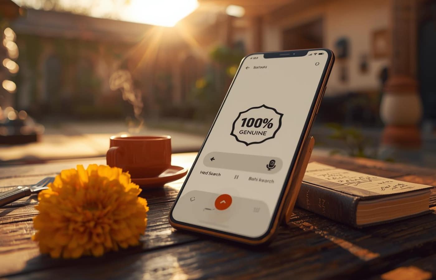
Users in Bharat often approach digital platforms with skepticism, having been burned by hidden charges, fake products, or poor return policies. Consequently, great UX becomes a force multiplier for building trust. Successful platforms utilize “Redundant Value Props,” consistently repeating critical promises like “Free Delivery,” “7-Day Returns,” and “100% Genuine” throughout the user journey. Peer validation through customer reviews and photos carries significantly more weight than brand claims.

The “Mic” Button and the Voice-First Revolution
One of the most significant UX innovations for Bharat is the transition from text-based search to voice-activated navigation. By 2026, voice search is projected to be the standard for “frugal AI” applications designed for Bharat. Users often find typing in English or even Hindi difficult on small screens; thus, a “Mic” button that supports “fuzzy” and “phonetic” search (e.g., showing results for “shoes” even if the user types “shooz” or “shooj”) is essential.
Localization through Cultural Nuance: The Meesho Case
Meesho provides a notable example of how Indian startups are redefining accessibility. In 2022, Meesho added support for eight vernacular languages, including Tamil and Telugu, removing cultural barriers. Their UX includes an AI-powered voice bot providing human-like support in Hindi and English, with plans for more regional languages. A key cultural win in their product UX is the recognition of colloquial terms—searching for “chasma” instead of “sunglasses” yields accurate results, reflecting how users actually think and speak.
Case Study: Paper Boat—Bottling Nostalgia and Cultural Rituals
Paper Boat emerged in 2013 with a strategy that didn’t just compete on flavour but sold “memories”. In a market crowded by global cola giants, Paper Boat chose to revive traditional Indian beverages like Aam Panna and Jaljeera.
Emotional Branding through Micro-Storytelling
Paper Boat’s branding is anchored in the philosophy of “Drinks and Memories”. Their packaging is clean, minimal, and softly coloured—resembling a handwritten note or a memory. Each bottle features micro-storytelling: short, poetic anecdotes on the back of the pack about school days, summer holidays with grandparents, or monsoon rains.

Bridging Two Worlds
Paper Boat took traditional recipes—often linked to home remedies or unhygienic street vendors—and gave them modern credibility through premium design and quality control. They avoided flashy celebrity endorsements, preferring the “soul” of the product to speak for itself. This emotional moat allowed them to charge a premium over local juices while expanding beyond metros to create regional flavour extensions like Panakam or Aam Kali.
Case Study: Forest Essentials—The Art of Luxury Ayurveda
Forest Essentials transformed the Indian beauty market by merging ancient Ayurvedic practices with modern luxury aesthetics. While mass-market Ayurvedic brands like Patanjali focus on utility and price, Forest Essentials created a new category of “Luxurious Ayurveda”.
Packaging as a Purpose-Driven Medium
The brand’s visual identity reflects traditional Indian wellness with a premium appeal. They utilize deep colours inspired by Indian spices—Kumkum Red and Warm Gold—to create a royal and inviting feel. Their storytelling emphasizes a “farm-to-face” supply chain, sourcing ingredients from local farms to ensure freshness and support rural communities.
The packaging is not just a container; it is a visual reminder of the brand’s commitment to purity and heritage. By employing sustainable production processes and high-quality formulations, they increased the value of ancient practices for the modern luxury customer. This strategy has been so successful that the brand has expanded internationally, rivaling global names like L’Occitane.
The Evolution of Corporate Voice: FabIndia and NID
FabIndia represents the bridge between traditional craft and the modern lifestyle brand. Founded in 1960 to market Indian craft traditions, it started as an export shop before opening its first retail store in New Delhi in 1976. FabIndia’s legacy is built on a social conscience, combining profit with sustainable livelihoods for over 50,000 weavers and 90,000 artisans.
The brand’s visual identity has evolved while remaining rooted in handcrafted aesthetics. FabIndia didn’t need big-budget celebrity campaigns; instead, its timeless designs—utilizing block printing and handweaving—found their way into the wardrobes of cultural icons. However, as a new generation of consumers emerges with different consumption habits, FabIndia has expanded its “Experience Store” model to include Fabcafes and wellness sections, producing higher revenues while maintaining its ethnic soul.
Glocalization: When Global Brands Speak Bharat
The success of global giants in India often hinges on their ability to “glocalize”—adapting their global identity to local social and religious nuances.
McDonald’s: The Maharaja Mac Transformation
McDonald’s famously recognized that the beef-centric Big Mac would not work in a predominantly Hindu nation that reveres the cow. They introduced the “Maharaja Mac”—a version of the Big Mac made with chicken or lamb—and a wide array of vegetarian options like the “McAloo Tikki” burger. This marked the beginning of a deeper localization strategy that included “VegPizzaMcPuff” and “Paneer Salsa Wraps,” catering specifically to the Indian palate while maintaining the iconic golden arches.
IKEA: Designing for the Indian Home
IKEA’s entry into India involved a meticulous study of the Indian way of living. They realized that the Western “Do-It-Yourself” (DIY) model was alien to an Indian audience accustomed to the assistance of local carpenters. To counter this, they allocated one-sixth of their store staff to assembly and partnered with Urban Company for last-mile assembly services.
Visual and product adaptations included:
Dimensional Changes: Cabinets and countertops were reduced in size to match the height of Indian women.
Cultural Habits: Selling larger beds because children often sleep with parents until elementary school.
Visual Association: Using solar-powered auto-rickshaws as delivery vehicles to foster a local connection.
Food Localization: Offering vegetarian meatballs and samosas in their store restaurants to respect local dietary preferences.
The Graveyard of Hubris: Why Western Templates Fail
Several global brands have failed in India because they mistakenly believed that global success could be replicated through a simple “copy-paste” model without cultural adaptation.
Tata Nano: The Stigma of “Cheap”
The Tata Nano was launched with the vision of providing an affordable car to the masses. However, the marketing campaign heavily emphasized affordability, portraying it as the “cheapest car in the world”. This strategy backfired as Indian consumers, driven by aspirations and status, did not want to own something explicitly labeled as “cheap”. In India, a car is a symbol of achievement; by branding the Nano as an entry-level utility, the company stripped it of its aspirational value.
Gillette Vector: The MIT Research Error
Gillette’s failure with the “Vector” razor provides a classic marketing lesson in the “innovation blindspot”. Before releasing the Vector in India, they conducted research and discover that Indian men had thicker hair than Americans. However, they conducted this research with Indian students at MIT in the US. When the product launched in India, it failed because they missed a critical cultural detail: Indian men in smaller towns often shaved with a single mug of water rather than under a running tap. The plastic component designed to unclog the blade was useless in a mug, rendering the razor ineffective for the mass Indian market.
Axe: When Humour Fails in Translation
The deodorant brand Axe entered the Indian market with its global campaign featuring women mesmerized by the “Axe effect”. While this hyper-macho humour worked globally, the Indian audience found the commercials offensive and disrespectful. The brand failed to adapt its humour and innuendo to the more conservative preferences and social norms of many Indian consumers, leading to a loss of market share to brands that understood the local emotional code.
The Tech-Aesthetic of Bharat: Zerodha, CRED, and Meesho
Modern Indian tech brands are defining a new “Digital Bharat” aesthetic that moves away from the Silicon Valley obsession with “engagement” toward utility, trust, and artistry.
Zerodha’s Anti-Engagement Philosophy
Zerodha, India’s largest stockbroker, operates on a philosophy of “user disengagement”—the opposite of the standard tech model. They avoid frequent push notifications and manipulative design intended to keep users “hooked”. Their platform, Kite, uses a fast, clean, and modular design that focuses on simplicity and first principles. This restraint is what has built their “moat of trust” among millions of retail investors.
CRED’s NeoPop Movement
CRED has taken a different route, creating a “genre-bending” design language called “NeoPop”. Inspired by the Edo period of Japan and the Superflat movement, NeoPop aims to democratize “high art” and present everyday financial tasks in a beautiful, artistic way. They use advanced frameworks like OpenGL to render graphics that excite and spark joy, treating digital design as a premium lifestyle experience rather than just a utility.
D-Mart: The “Ugly” but Brilliant Success
In retail, D-Mart has succeeded by doing the exact opposite of global giants like Walmart. While Western models emphasize wide aisles, large assortments, and a “shiny” retail experience, D-Mart focuses on an “ugly but brilliant” model: no frills, ruthless backend efficiency, and consistently low prices. This resonates deeply with the Indian “paisa-vasool” (value for money) mindset, proving that for Bharat, functional value often trumps aesthetic polish.
Strategies for the Modern Indian Design Agency
As India’s digital ad spend reaches INR 40,800 crore in FY2024-25, surpassing television for the first time, agencies must adopt a “Bharat-first” mindset.
1. Temporal Resilience and Cultural Depth
The future of Indian design lies in “temporal resilience”—the ability to use ancient craft as a anchor for modern innovation. This means moving beyond the “literal” to the “evocative,” creating work that resonates with an evolving, aspirational India.
2. Hyperlocal and Regional Tuning
Brands must recognize that India is a network of dialects. This requires “Regional Tuning”—adjusting script, iconography, and layout to match the cultural ground of a specific region. For example, ZEE5’s rebrand strategy of launching seven curated language packs reflects a move toward “depth over breadth” in a fragmented market.
3. Sustainability as “Jugaad”
In India, sustainability is not just a “green” trend; it is rooted in “jugaad”—the practice of resourceful innovation born from necessity. Designing with reuse, repair, and repurpose in mind is culturally intuitive for an Indian audience and should be integrated into brand identity rather than treated as a marketing afterthought.

Conclusion: The New Language of Belonging
The transition to the visual language of Bharat is not merely a design trend but a “cultural alignment”. It is the realization that when content and design are told in a user’s own “visual language,” it doesn’t feel like a product—it feels like their own story. For the modern Indian design agency, the challenge is to stop “copy-pasting” Western templates and start “inhaling life” from the vibrant, complex reality of India.
The new aesthetic is rooted, confident, and forward-looking. It is a “mesh” that can be minimal and maximal at the same time, traditional and modern, structured and improvisational. As Indian design elevates itself globally, it does so not by imitating others, but by refining its own unique, poly-vocal voice. The agency landscape now understands that the most powerful design in India is the one that lets the user see themselves in the pixels, the scripts, and the stories. This is the Bharat Renaissance—a moment where visual language finally reflects the nation’s soul, its people, and its journey.
About the Author
Bold Tadka is a full-service creative and digital agency based in Kolkata, India. We specialize in marrying cutting-edge technology with deep cultural insights to build brands that don’t just scale, but resonate. We drink too much Chai/Coffee, argue about Cricket/Football, and use AI to make our human ideas bigger, not to replace them.
Kindly Share Your Thoughts If You Like/Dislike The Blog